Is it time to protect certain logos so they cannot be changed at will by vanity?
On the first floor of one of the Deutsche Bank Twin Towers in Frankfurt, there’s a very special room.
The space is art gallery-like. Large. Immersive. Impressive. With dramatic lighting, huge video walls, and spot-clean cabinets. In one of them, behind a perspex glass, lies the very first drawing of the Deutsche Bank logo. The room is almost exclusively dedicated to the bank’s brand mark, the iconic ‘slash in a square’.
In July 1972, eight famous graphic artists were commissioned to create a new logo for Deutsche Bank. The brief was quite simple. “The logo should be able to unmistakably represent the company”.
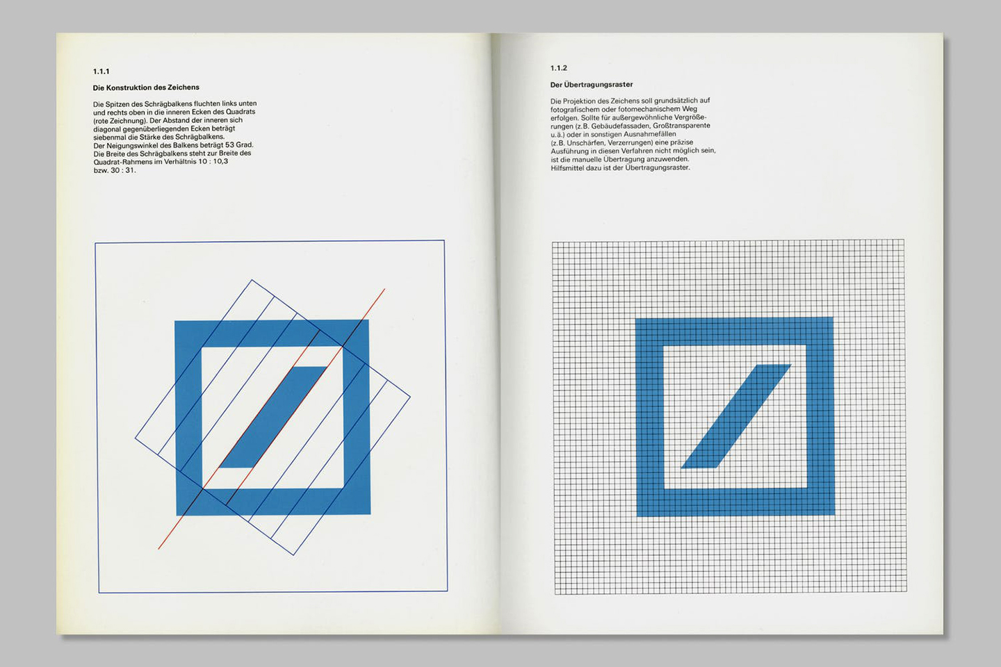
From a choice of several brand designs, Deutsche Bank decided upon a symbol created by the painter and graphic artist, Anton Stankowski. The ‘slash in a square’.
For Stankowski the ‘slash’ stood for consistent growth and dynamic development. The square-shaped frame symbolized security and a controlled environment. Together they captured the idea of “Growth in a stable environment.”
The logo is an extraordinary example of german rationalism. Solid. Sound. Authoritative. Next to it, the name of the bank is written in Adrian Frutiger’s Univers, a swiss-german typeface. Everything asymmetrical, ranged left. It really doesn’t get more germanic than that.
Stankowski’s logo has “represented the company” since 1974, enduring at least a couple of financial crises and surviving at least a dozen logo design trends.
Is it strong enough to save Deutsche Bank from the reputational damage of being Trump’s main lender (and creditor) and the stigma of being labeled by the FMI “the Greatest Risk to the Global Financial System”? I don’t know. That’s a story for the folks over at the Financial Times.
Is someone, somewhere in a room on the Deutsche Bank Twin Towers in Frankfurt considering a rebranding as a way to overcome major business challenges that have nothing to do with the identity? Almost certainly.
Because like any other important, iconic, timeless identity, the Deutsche Bank logo is just FIVE meetings away from being destroyed.
—
Standing on the shoulder of giants
(and feeling the weight on mine).
A tour of the DB brand space was part of my Deutsche Bank brand induction, and it definitely left a mark on me (sorry). During the visit, the guide mentioned that in Germany, the Deutsche Bank logo is more widely recognized than the Nike swoosh (don’t quote me on that).
The tour is a very effective way of perpetuating the logo’s sacred qualities for anyone involved with the brand. While working for Deutsche Bank, I always felt the privilege of having to use such a seminal piece of work, but also the responsibility of dealing with one of the most important brand identities of all time. Precious, untouchable.
I remember multiple conversations with the designers working on the project about how to use the logo. I remember (with a certain degree of terror) design crits when I looked at the wall and saw the ‘slash in a square’ centered, cropped, distorted, outlined, constructed with dots, made into a pattern…
I went with Stankowski every time. Put it in the top left corner and we’ll be fine.
—
To change or not to change.
‘Why?’ is the question.
Every time we tackle a rebranding brief we ask ourselves what to do with the current identity. What to keep, what to tweak. What to change, what to invent… “Evolution or revolution?”. “Step, leap or jump?”. We use them all.
At this crucial point in the creative journey, the key concept is responsibility. I personally need an extraordinarily good reason to change a brand’s logo. Thousands, possibly millions of dollars/pounds/yen/euros have been invested in building equity in it. It’s a brand asset.
Used well, the existing logo can be the constant that helps recognition and attribution while everything else changes. Almost like a beacon of certainty to assure you that you’re still dealing with the same brand you love (or hate). It gives you the latitude to be much more forward thinking with the rest of the identity.
Now, before you accuse me of logo conservatism let me tell you, we change a lot of logos.
Sometimes that change is an “optimisation of the logo”. So it reads better in digital, at small sizes for example. Sometimes is a refinement: removing a quirk that feels dated.
In some instances, the need to signify change is so important that a new brandmark is necessary.
And in some cases, companies got themselves in such a mess, the identity is so broken that the only solution is a face transplant. A proper, scalpel in hand, reconstructive intervention of plastic surgery.
As we run through all of these scenarios for different brands, the important question we ask ourselves is: are we changing this out of vanity? Is it just because we want to live our mark? (sorry again).
Creative Directors, Brand Managers and CMOs that run on vanity can make truly fatal mistakes for brands, and, frankly, for our visual landscape. Only Vanity can explain what has happened recently to the identities of several fashion houses that have seen their logos vandalised by a cohort of narcissist Creative Directors. You know who they are. No snitching, i don’t want to get a letter from Paris. ALthough I am sure the stationery would be fabulous.
My suggestion for those Creative Directors, Brand Managers and CMOs is that they focus their energy on Brand creation projects, not brand development ones.
—
UPS, they did it in 2003.
Let’s have a look at an example. Take the company formerly known as the United Parcel Service.
I was a young designer full of dreams in 2003, but I remember my feeling when Paul Rand’s 1971 classic logo for UPS was replaced by a skeuomorphic 3d-ish shield, a new logo typeface and, crucially, got rid of the lovely bow tie at the top of the previous identity.
Now, I know exactly why UPS got rid of the bow tie. I have re-read the articles and the press releases. “Under strong pressure from the competition, a new refreshed positioning was needed”. “We do so much more than packages now” read the press note. “We’re a logistics company”. Etc. Etc.
Nonsense. It’d be like the WWF changing its iconic logo because “they save so much more than just pandas.”
—
Stopping the vanity
Introducing The Logo Heritage List
Here comes the provocative bit.
The question I ask myself sometimes is: should brands be even “allowed” to change some truly iconic, seminal identities? Are certain identities not part of the very fabric of industry, society and culture, created by eminent, extraordinary people, to the point where they don’t solely belong to the business that owns them any more?
I know what you’re thinking. “It’s their logo, their copyright, their trademark, and intellectual property, you plonker”. Wait! Before you go straight to the comments section, hear me out. Let me give you an analogy from the world of architecture.
We have a system in England to protect buildings (and monuments, wrecks, parks, gardens, and battlefields). It’s called The National Heritage List, or 'The List'.
Buildings are listed if they are considered to be “of national architectural or historic interest, so that it can be protected for future generations”. Hold on to that idea: “so that it can be protected for future generations”.
There are three types of listed status. Grade I buildings are of exceptional interest. Grade II* buildings are particularly important buildings. Grade II buildings are of special interest.
Listing is not a preservation order, freezing a building in time. It means that consent must be applied for in order to make any changes to that building which might affect its special interest. Listed buildings can be altered, extended and sometimes even demolished.
But at least you have to check before you alter, extend or demolish. Unlike the bunch of terrorists that demolished the Art Deco Firestone Factory in Brentford, London over the 1980 August Bank Holiday, sparking the modern Listing movement.
I know that commercial art, graphic design and branding are relatively new disciplines, without the gravitas, permanence of our cousin at the top of the creative pyramid, the almighty architecture. But I feel that the same logic could apply to our work. That there are certain things that should be protected “for future generations”.
I hear you say “there will always be in books, for younger generations to check”. But books are not the place where branding lices, is it. It is in brand experiences, alive, amplified.
So my point is… Should we not have something to The List but for logos?
Take the Fedex logo (continuing on the topic of parcel services). Designed by Landor Associates in 1994, the negative space between the E and the x creating an arrow, an absolute pinnacle of clever, smile in the mind, iconic brand identity.
Yet, again, only five meetings away from being changed. Its beauty lost forever.
Should it not be protected by some kind of Listing, so at least they have to ask before making it upper case and removing the arrow because “we not only move things to the right. We also move them to the left”.
I don’t know about you, but I dread the day when someone is going to show me Pirelli’s new logo. NBC’s new logo. got rid of Chermeyers’s Peacock.
So that’s why I am starting the Grading 1 System and I am going to go with my starting ten. Recommendations welcome. Let’s make this happen.
1 Chupa Chups
2 La Caixa
3 Ford (I am really worried about this one, and it has been tried in the past, see Paul Rand’s)
4 HSBC


No comments.